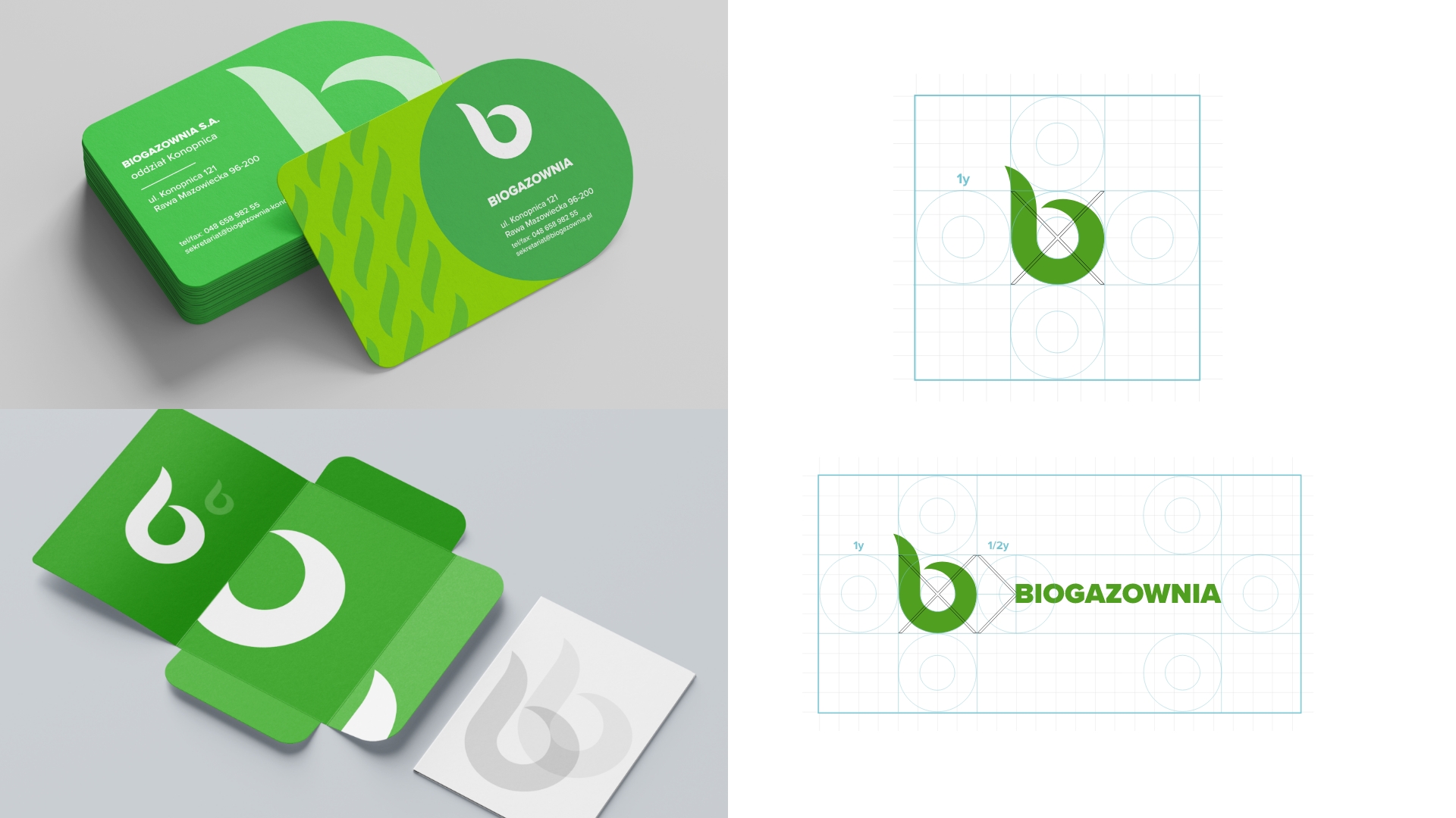
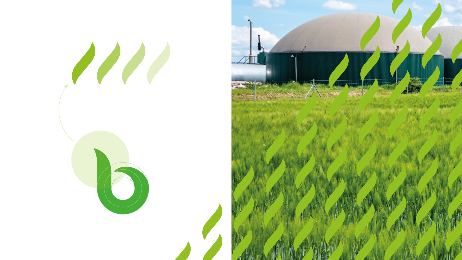
Based on the research, we designed a new green version of BioEvolution’s logo, which is to become a visual differentiator for all initiatives related to the company’s operations.
The basic version of the mark is a b-shaped pictogram, which symbolizes the company’s operation in harmony with nature. The mark is a typographic representation of elements found in nature and clearly refers to organic motifs.