Territorial & Legal
We create a strategy that takes into account local conditions, thus designing consistent communication and activation of specific target groups.
Creation and development of a comprehensive communications strategy, brand model and design of corporate identity and website.
- Conduct strategic workshops to build a brand that becomes synonymous with professional and modern exchange of legal services.
- Develop target groups, brand model, pain points and awareness building activities for attpoint along with communication of key benefits.
- Prepare funnel strategy and communication channels, message house, and propose social media activities.
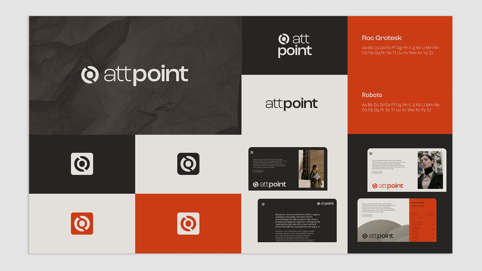
- Design of comprehensive visual communication – logo, typography, color scheme.
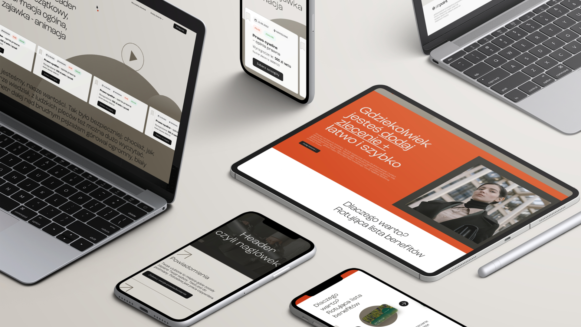
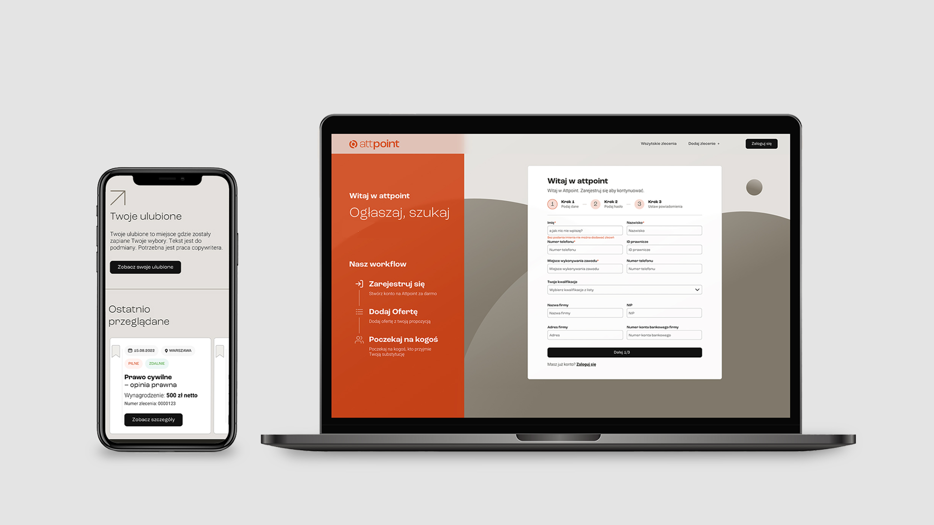
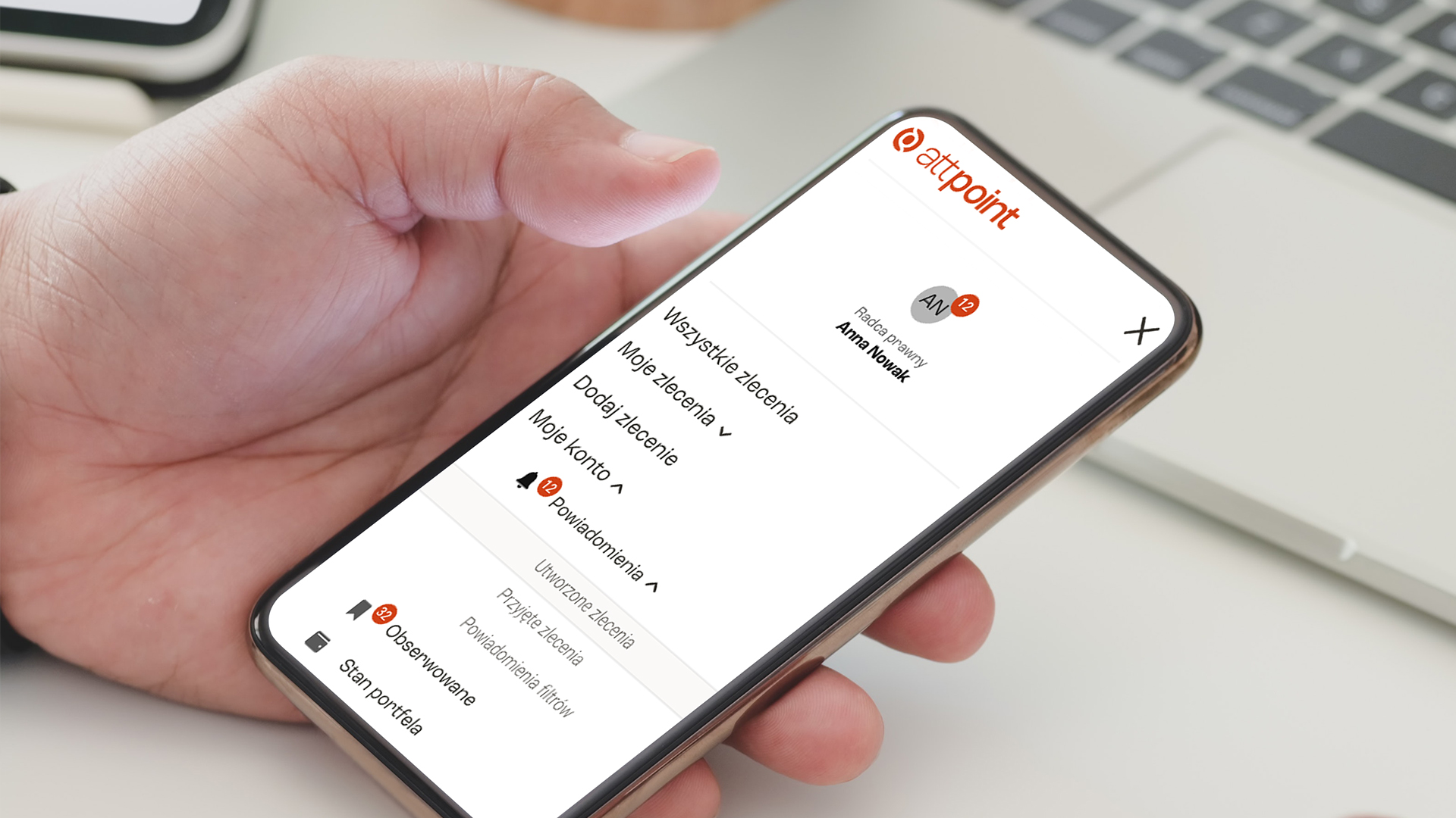
- Creating a website design that conforms to current design trends and meets high UX/UI standards.
CORPORATE IDENTITY
PACKING DESIGN
PACKING DESIGN
The goal of marketing activities for attpoint is to change the behavior of lawyers regarding the search for substitution and exchange of legal services.
Create a communication strategy to build brand identity and image
Our goal has become to build a brand that will become synonymous with professional and modern exchange of legal services. The collaboration with attpoint began with a strategy workshop. First of all, it allowed us to understand the brand values together and consider whether they are relevant to the audience. During the workshop, many important questions were raised – such as. What are the unique features that should resonate with the audience?
What is the essence of the brand? What should the recipients understand? The answers helped create a user path and develop points of contact and diagnose pain points, which became crucial for effective promotional activities.
We focused primarily on building awareness of attpoint’s existence among the target audience, the benefits of the brand’s main benefits over other solutions, communicating the platform’s leading functionalities, and ensuring its credibility (mainly based on the number of users and transactions and security).
Creating a positioning strategy
Positioning a brand in the right way is to present its character and reach the right target audience. So we have developed 3 pillars: SAFETY – CONVENIENCE AND EFFICIENCY – MODERNITY. First, the platform is intended to be an alternative to the “wild,” chaotic and unregulated search for partners by groups on social media, allowing them to choose reliable and proven partners. Secondly, we emphasize all features that increase control over the process of substitution and exchange of legal services. We treat attpoint as a tool for improving management and for business development. Third, we expose how attpoint offers a new quality and fits into the broader context of the increasing digitization of legal services, appealing to the aspirations of modern lawyers.
The well-thought-out structure of the workshop and a thorough understanding of the brand’s values made it possible to create its new model, which is of great importance on many levels – positioning, communication, image and sales. Thus, we extracted the essential elements of the brand, answering the key questions of its model:
- What is the main feature that defines and differentiates the brand from the competition? – Easily and securely connects professionals
- What are the most important values for the brand? – Partnership, professionalism, trust, approachability, caring, shrewdness
- What human qualities and attributes should a brand possess? Among others: openness, directness and professionalism
- What are the most important/key functional and emotional benefits the customer receives from the brand? Rational: Finding an affordable replacement quickly and easily; Emotional: Not worrying about frustrating activities that take up valuable time.
- What are the key differentiators and brand credentials? Reviews and endorsements, number of users, security, user experience.
Create a communication language that effectively reaches target groups
The main goal of the brand and its communications becomes to build awareness among the audience, as well as to show why using the portal is better than other solutions and how it addresses the “pains” of lawyers. So we created a main calim – Effective Legal Network – and brand storytelling that says attpoint is the first platform on the Polish market created specifically for lawyers, allowing them to network and optimize their work by easily finding substitutes and exchanging other legal services. Thanks to it, law firms and individual lawyers cut costs, save time and win assignments.
We decided on communication that would be based on simple, concise, specific and direct language. We have moved away from the overuse of legalese to shorten the distance between the brand and the user, creating a friendly, yet professional site that provides tangible benefits. Communication is action-encouraging, based on business benefits, causality and decisive steps. Our main focus was on handling concrete examples of the portal’s use, so that the recipient would know what they could use the services for and how they would make it easier for them to function in the legal world.
We also developed specific social media activities, which today are a key element of the communication strategy, allowing us to reach a wide audience. So we recommended working with legal influencers who will show the rest of us the benefits of using the platform in an authoritative role. In addition to this, attention should be paid to image-building activities, for which posting on LinkedIn, Facebook and Instagram is best – also shortening the distance and building awareness among new users. Reviews and testimonials that showcase users’ past experiences will also prove important in driving effective brand communication, building brand credibility. Mother’s content in the first stages is to focus primarily on education, which is based on high-quality legal knowledge.
Design of image communication - from logo to website
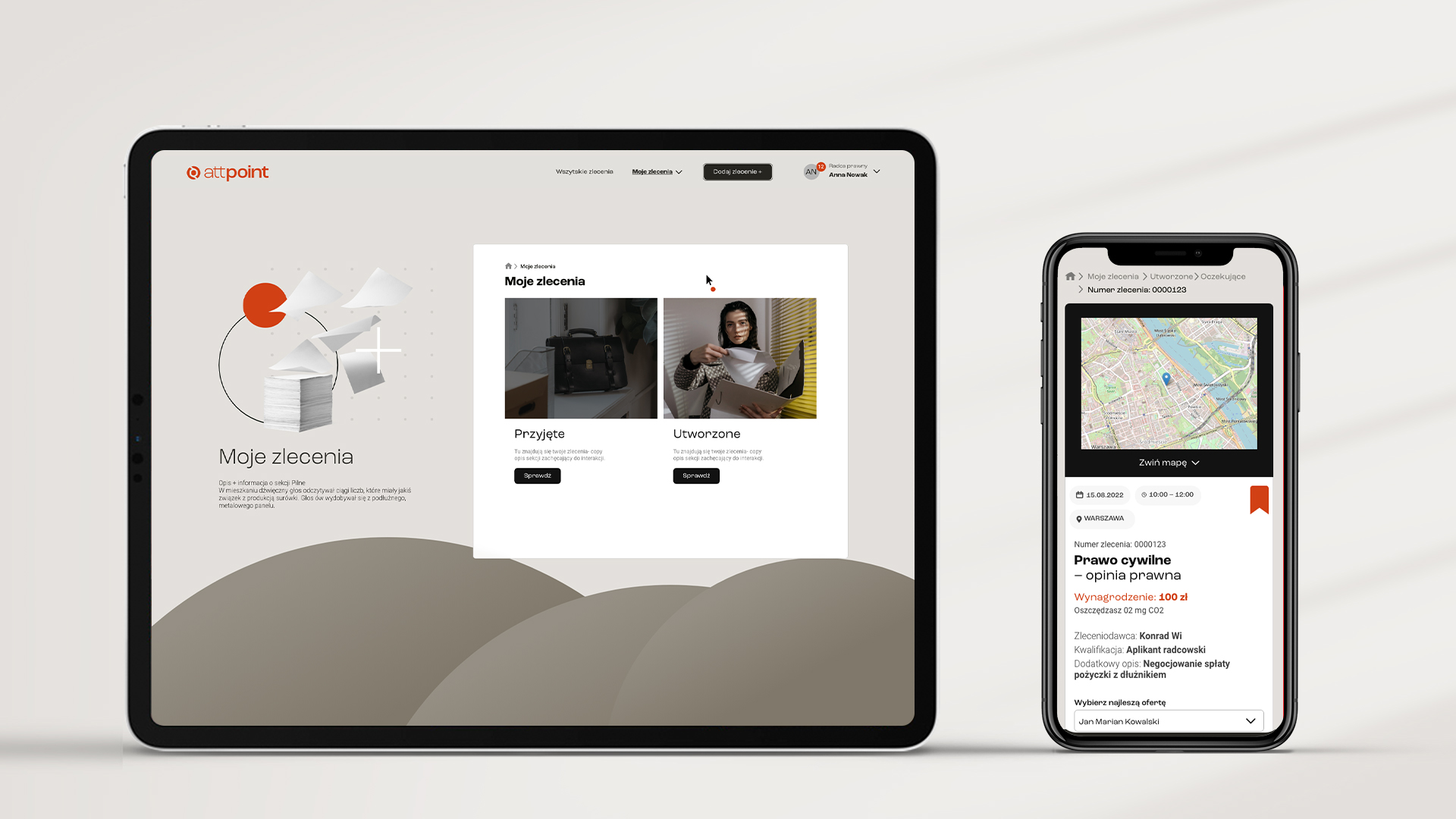
The new brand model and communications need a design that resonates with them appropriately, while ensuring a user-friendly experience. To this end, we developed the attpoint website, which represents a thoughtful visual brand identity. The images presented are not slope graphics, but show diverse characters that reflect the pluralism of the legal profession, while pointing out the grouping and benefits for different audiences (large law firms, smaller firms or managers). The color scheme, on the other hand, is a peculiar combination of elegance, solemnity (blue, beige) with colors symbolizing activity, optimism and invitation to action (orange), which significantly affects the perception of users.
We paid a great deal of attention to UX/UI on the project – after all, it plays a key role here when the entire service process is done through a web platform. We emphasized clear typography, which is based on clear messages directly conveying the necessary information. The design of the site is aesthetically pleasing, but does not affect the intuitiveness and accessibility of the site, creating a coherent whole with them. The user moves smoothly through the steps of the platform, helped by navigation and a logical information architecture. Graphic means of expression are not superfluous embellishments, but a practical addition to the design, organizing a friendly environment for moving around the platform.
Visual communication also included graphic design on other levels – banner ads or social media posts. In this way, we wanted to create an attractive and engaging visual message that is also consistent with the overall brand identity and values.
Cooperation with the attpoint brand is still an open topic that is constantly evolving to create more activities to support the brand. Ahead of us are further deployments, projects and strategic activities that will significantly affect attpoint’s position.
Zobacz również
Check out our Linkedin
© 2023 | Privacy Policy