AF.agency

Territorial & Legal

We create a strategy that takes into account local conditions, thus designing consistent communication and activation of specific target groups.

orlen_200x200

Font to suit ORLEN

  • A comprehensive typographic solution for all PKN Orlen brand communications.
  • Analysis of existing fonts and competitor solutions, as well as a strategy workshop with the client.
  • Graphic concept of the typeface in relation to the brand’s logo, branding strategy and a wide range of applications (print, digital, outdoor).
  • Geometric neogrotesk – modern, clear, functional and neutral, yet distinctive.
  • A versatile communication tool, reinforcing the consistency of the brand’s visual identity and its modern image.

COMMUNICATION STRATEGY

Integrated campaigns

Content marketing

BTL/ATL

Corporate identity

Social media

Activations

Design process

The development of the creative idea and concept for ORLEN Sans began with a detailed analysis of the use of current fonts in the ORLEN Group, as well as a review of competitor solutions. A workshop with the client helped define typographic needs and goals, which became the basis for further conceptual and design work. The activities resulted in a full design process – from research and sketches to final production and post-production – culminating in the creation of a proprietary typeface along with a set of production files and technical documentation.

Definition of the challenge and assumptions

The fundamental challenge was to design a corporate typeface with a wide range of applications, whose graphic form would meet the diverse needs of the brand’s visual communication and audience. The typeface had to be fully adapted to both technological requirements – such as digital printing, offset printing, screen printing, UV printing, digital applications or plotter and laser cutting – and formal requirements, i.e. the possibility of use in headlines, continuous text, interfaces and outdoor materials. The design was embedded in the brand’s existing visual identity system, taking into account the typographic specifics used in communications so far.

Analysis and inspiration

The process began with an analysis of current typographic solutions used by the PKN Orlen brand, such as Proxima Nova, Fakt Pro and Futura. These are geometric writings, neutral and functional, but lacking individuality. In parallel, a benchmark analysis was carried out – among others. Coca-Cola, Netflix, Nike, Inc. or Shell – focusing on the ways in which global brands build their identities through typography. The strategic workshop made it possible to set creative directions: modernity, development and technological on the one hand, and proximity and accessibility on the other, in line with the strategic values of the ORLEN brand for 2025-2035.

From sketch to finished font

Based on this, the first sketches and moodboards were created, which evolved into three different graphic concepts for the typeface. The design of the letters referred directly to the brand’s sigil and logotype, taking into account the diversity of fields of use and communication needs. Tests were conducted in real-world environments – from printed and outdoor materials to digital user interfaces. After consultations and feedback sessions, a final version was created, including ten typeface variations: Black, Extrabold, Bold, Semibold, Medium, Regular, Light, Thin, Condensed and Italic.

The nature and significance of ORLEN Sans

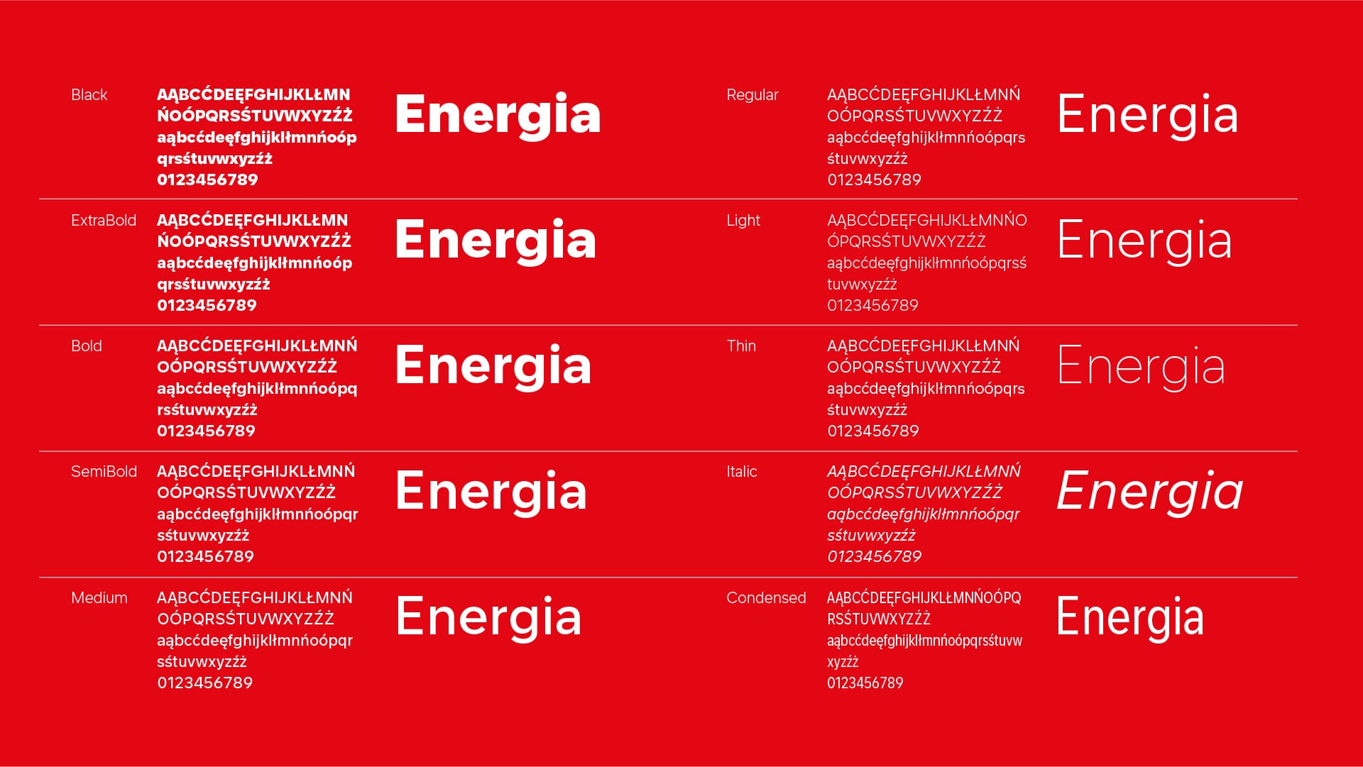
ORLEN Sans is a geometric neogrotesque with low contrast, wide aperture and large interior letter lights. It provides high readability in small sizes and on screens of digital devices of different resolutions, as well as in large-format printing. The typeface includes 600 glyphs per variety, supports the Latin and Cyrillic alphabets, and supports 286 languages. Its structure was designed to emphasize the modernity and dynamism of the concern, while maintaining a neutrality that allows for wide use. The final result of the work is a full-fledged communication tool that supports the consistency of the visual identity of the ORLEN brand, strengthening its recognition and the strength of its message.

Zobacz również

Your message has been sent. Thank you!