AF.agency

FMCG

The fast-moving consumer goods industry requires decisive action to distinguish the brand from the numerous competitors, so we designed many creative, original and strategic solutions to activate consumers.

Localism and optimism of the Trzy Korony brand​

The successful rebranding of Nowosądecki Brewery’s products resulted in an award in the DESIGN category of the 2018 GOLDEN ARROW competition.
  • Developing a communication strategy based on the history of local heroes linked to the Nowy Sącz region.​
  • Comprehensive visual identity – changing the logo and visual themes, taken from local legends.
  • Product rebranding – original packaging designs that stand out among other craft breweries and encourage people to learn more about the hero’s story.​

BRAND STRATEGY

BRAND IDENTITY

CORPORATE IDENTITY

PACKAGING DESIGN

Our collaboration with The Three Crowns Brewery began with analysis of the brands heritage, deeply incorporated into local tradition, legend and storytelling. Hand in hand with our client we took off onto an inspiring journey to seek for brand's origins and potential and present it in a modern shape. We had three key stops: passionate communication strategy, complex brand identity and packaging design. Our discoveries resulted in 2018 Golden Arrow nominations.

Challenge 1: Brand identity close to nature

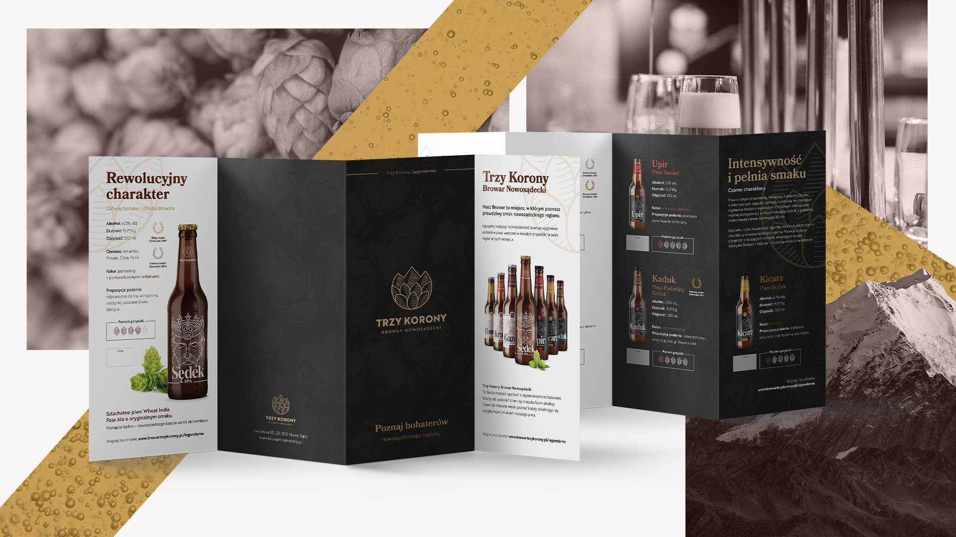
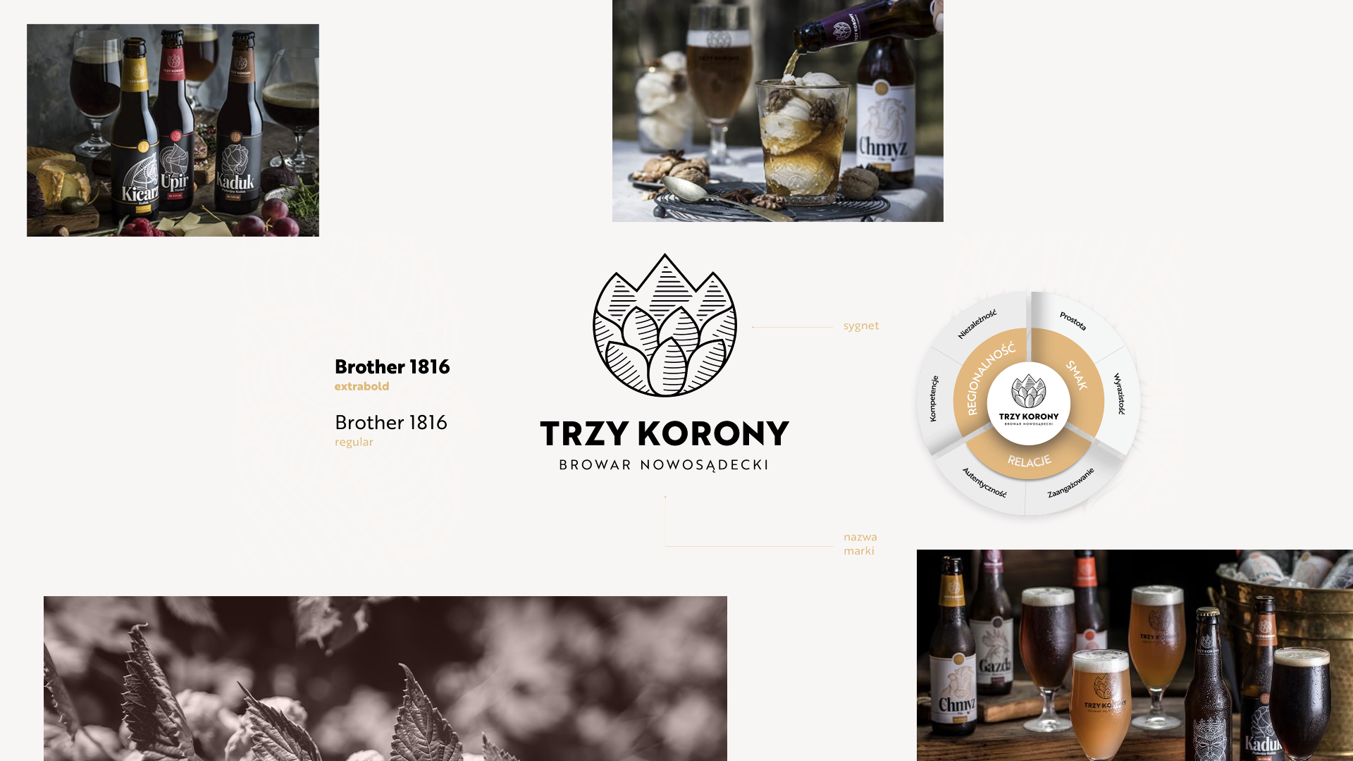
The Three Crowns Brewery first showed us its potential during the inspirational workshops, where basic brand principles and visual language where established. Brands aspirations and parallel competition activities helped us to shape its DNA, which quickly became a foundation of future communication. Brand Identity Manual present key values of the brand, which help define brand’s personality on the market.

Rooting in local tradition and heritage, The Three Crowns Brewery remains independent of forward-thinking. Legendary, mythical heroes of the region were brought to life using attractive narration straight from the Polish highlands.

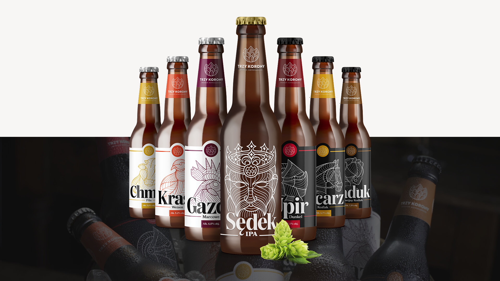
Each product became a separate hero ambassador, so close to local inhabitants (positive heroes in white labels, black characters in dark labels). Key historical figure was based around Sędek, a local knight of strong and independent character.

Challenge 2: Marrying tradition with modernity

Connecting tradition with modernity is clearly represented in the trade mark. The logo is both minimalist, yet historical. Built on sign and name of the brand it represents the shape of the Three Crowns peak arising from the hop leaf. The name is enriched with local place of origin of the product.

Main visual motive is based on traditional figures of brand heroes. Each product has a different feel to it, making them individual and original, to engage consumers and provoke them to search for their favourite taste.

Challenge 3: Building an impactful product

Packaging gave us wings! Each bottle stands out among local craft breweries and its slim shape lays mildly in hand. Labels tell stories of the brand and its heroes. The mark becomes a stamp expanding the label, which makes it more visible. The reverse of the label continues to engage the consumer in brands heritage. The final design has been gently wrapped around the bottle thanks to screen print.

Zobacz również

Your message has been sent. Thank you!