Territorial
We create a strategy that takes into account local conditions, thus designing consistent communication and activation of specific target groups.
Kolobrzeg as a strong and distinctive brand
Design a comprehensive visual identity that highlights the uniqueness of the brand that is Kolobrzeg.
- Creation of a complete sign book with a new version of the logotype.
- Design of promotional materials.
- Develop a visual identity for the city with a consistent and modern character.
- Preparation of new signage for city institutions.
- Realization of an advertising spot that emphasizes the character of the city and is based on three key brand communication themes.
COMMUNICATION STRATEGY
PHOTO/video PRODUCTION
CORPORATE IDENTITY
Read the story of the new city identity of Kołobrzeg (Kolberg) and see how we found uniqueness in the Polish Baltic capital.
Kołobrzeg (Kolberg) is a place surrounded by natural richness, generating full, multi-level rejuvenation for the body, mind and soul. It’s a heart of complete rebirth based on harmonious, dynamic evolution. It embraces a healthy and active lifestyle both for citizens and tourists. These were core foundations to the new city branding and visual identification.
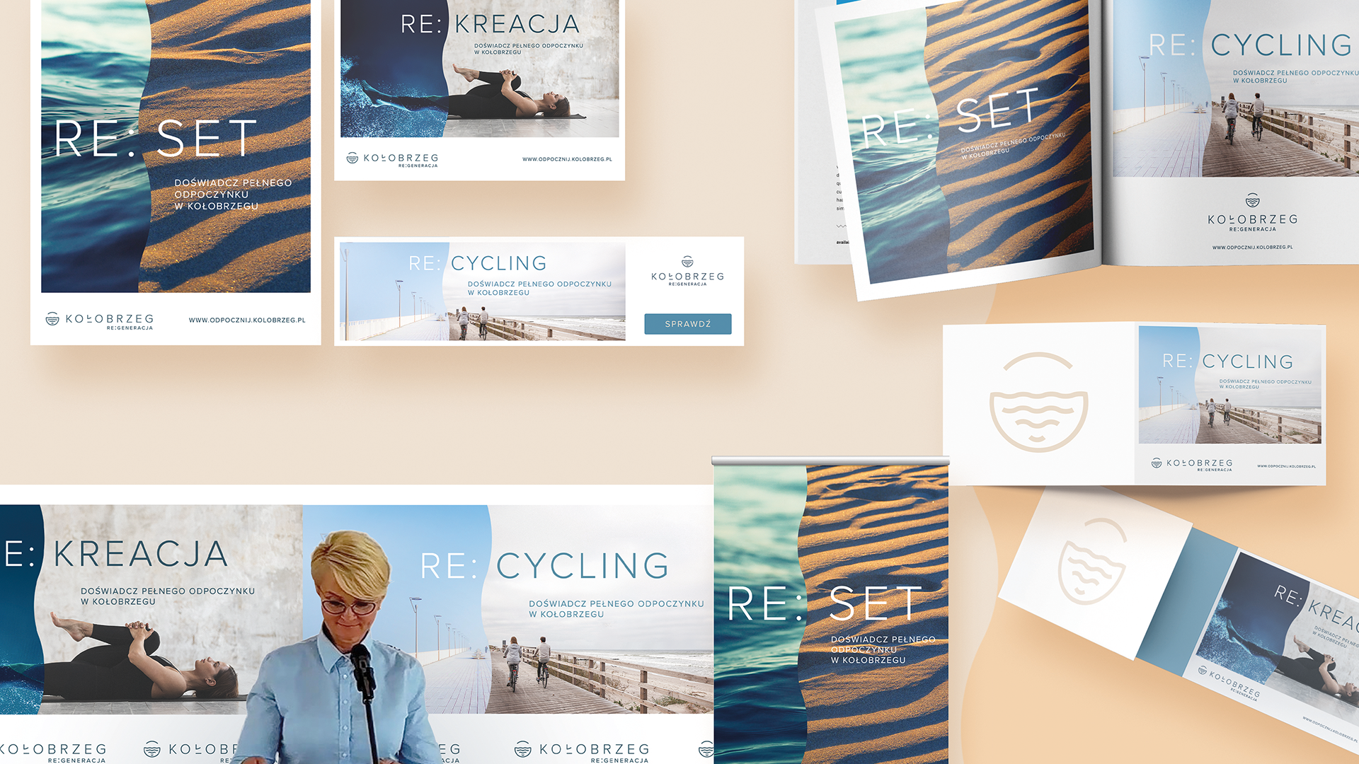
To differentiate Kolberg from other Polish seaside cities and share its progressive attitude, we developed a complex rebrand, creating a new identity, logo, brand guidelines, promo designs and a dedicated video spot.
To differentiate Kolberg from other Polish seaside cities and share its progressive attitude, we developed a complex rebrand, creating a new identity, logo, brand guidelines, promo designs and a dedicated video spot.

Challenge 1: In search of the leading motive
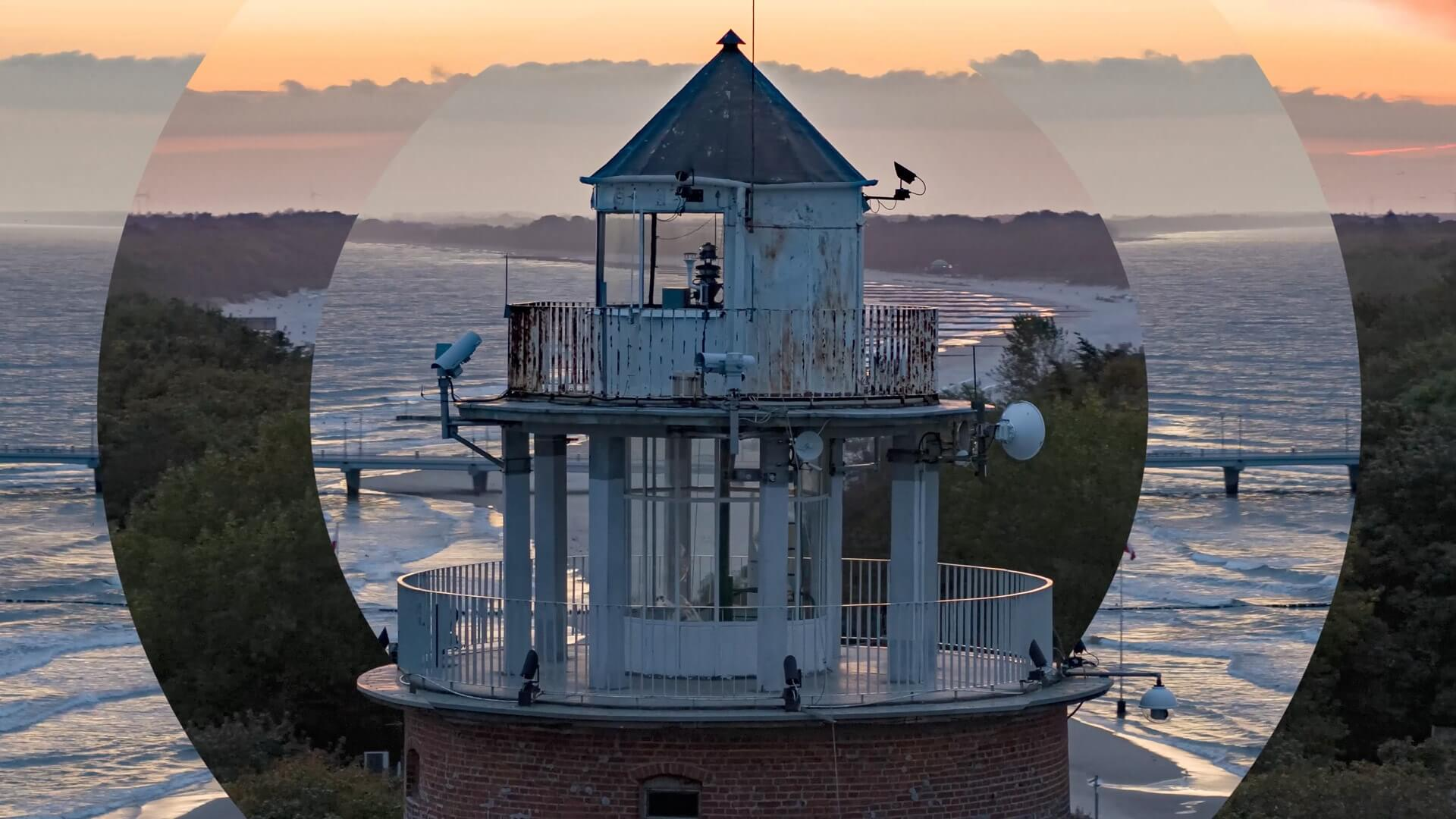
The elements of Kołobrzeg (Kolberg) – sandy beaches, warming sunlight, richness of the surrounding forests – these were the foundations of conceptual ideas for the new branding of the Polish Baltic capital. The outcome merged both nature and urban atmosphere in what is a natural symbol of Kolberg – the circle.
The circle represents positive energy of rejuvenation deriving from the city in connection with soothing calmness and harmony. Modern urban landscape underlines inclusiveness, perfection and a sense of complexity. It symbolises time, which stands for Kolberg’s natural evolution.
Disassembling the circle to basic parts extracted harmonic shapes that allowed us to build a strong, geometric representation of the emotions of Kolberg. City’s identity gained a coherent and modern character enhanced by a well balanced, dynamic typography.
The sign depicts a view of the sea locked in a circle. The sun means joy, vitality and liveliness – pure creative energy. Sea waves stand for the natural surrounding of the city, the unique climate of rejuvenation and rebirth.

Challenge 2: Moveable idea - a complex city rebrand
The elements of city’s new identity blend naturally with the urban landscape. Colour palette originating from natural elements together with a mixture of artistic textures make the new Kolberg looks stand out as bold and independent.
The dynamic tone of seawater at different times of day compose leading colours accompanied by beach beige and soothing hue of the Baltic wood. Visual communication of the brand underlines the marine character of the city, extending Kolberg natural strength.
Soon more sub-branding followed in the form of city’s most important institutions. Additionally bespoke marketing communication was designed to promote the city among tourists, inhabitants and other stakeholders of Kolberg.
Challenge 3: Engaging video communication
The final stage of the rebrand of Kolberg was a promotional video sharing the new image of the city with the general public. Minimalist concept of smart city philosophy was presented in a short film, where modernity coexists with the basic principles of nature in a human-centered balance and harmony.
Sky-view shots with added post animations depict 3 main motives of city’s communication: dynamic lifestyle, balanced nature and urban landscapes.
The inspiring character of Kolberg’s creative platform underline the city’s authority among other seaside locations around the Baltic Sea, setting trends and enhancing constant progression. It proves that the hygge philosophy is well suited for the Polish reality.

Zobacz również
Check out our Linkedin
© 2023 | Privacy Policy