Territorial marketing
We create a strategy that takes into account local conditions, thus designing consistent communication and activation of specific target groups.
The strength of tranquility in the rebranding of the Shuum Hotel
An overall rebranding of the brand, which spawned a narrative that turned to the Scandinavian philosophy of hygge and functioning in the spirit of slow life.
- Creation a new hotel name and logo – exposing the brand’s values.
- Redefining visual language and communication strategies.
- Organize creative workshops with the hotel’s team.
- Dedicated photo and video content.
WEBSITE DESIGN
COMMUNICATION STRATEGY
BRAND IDENTITY
BRAND STRATEGY
CORPORATE IDENTITY
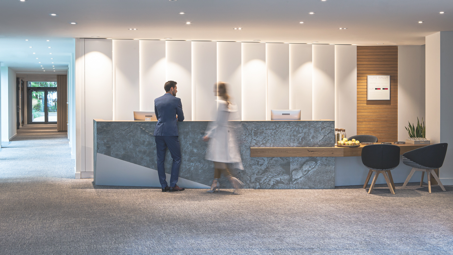
Shuum is a 4 star boutique wellness hotel in Kołobrzeg (Kolberg) at the Polish seaside, close to wild, Baltic nature. Brand's ambitions reach far in communication and identity, drawing from holistic expertise of slow life, natural rejuvenation and healthy, local cuisine.
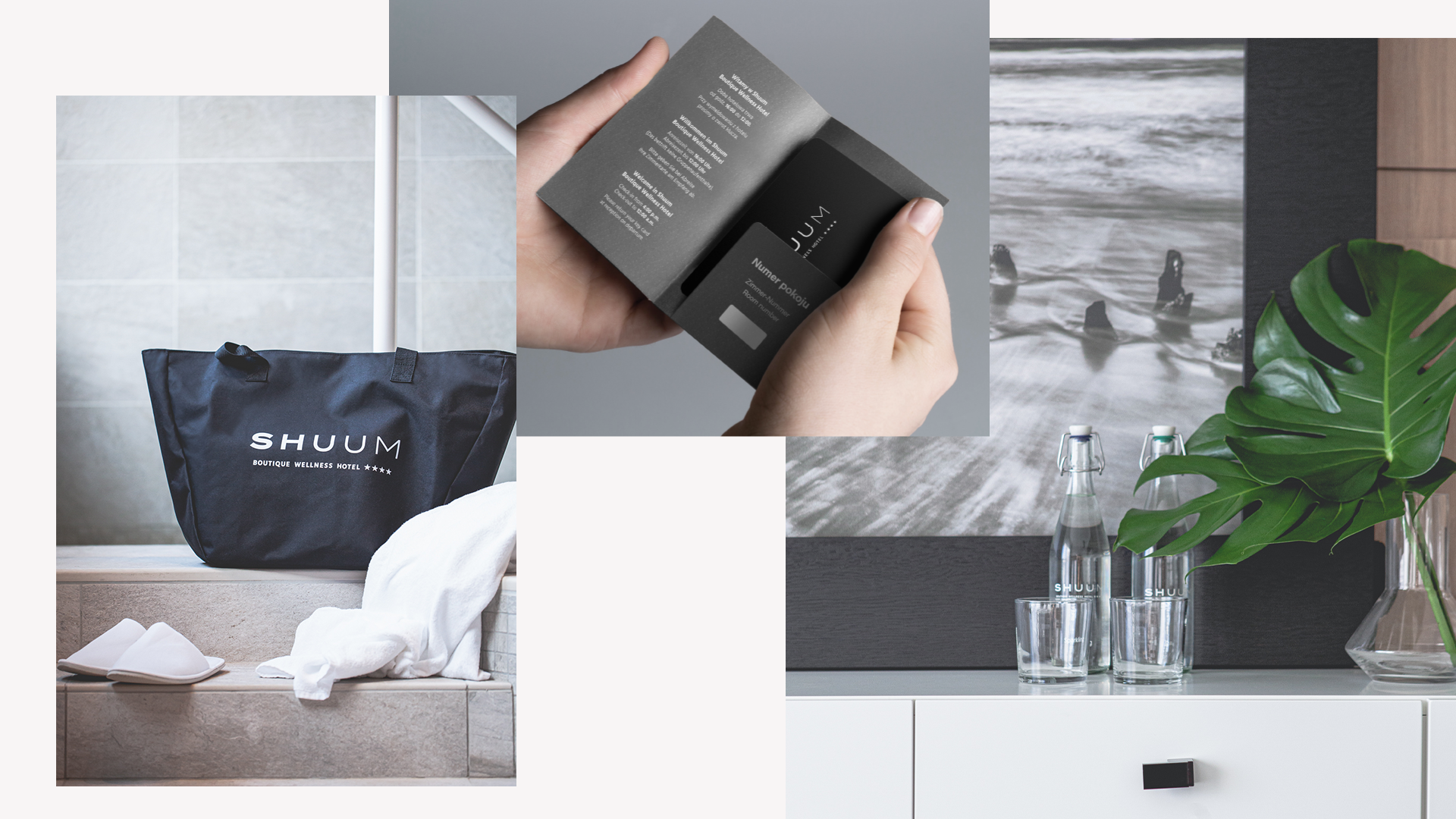
Challenge 1: How to convey brand's philosophy in just two words?
Shuum hotel rebrand introduced key values, that the facility offers to its visitors – complex care, contact with nature and soothing surroundings. It’s a natural answer to consumer overstimulation and everyday haste and stress, bringing balance, harmony and rejuvenation.
Main challenge? Create a name for the hotel. During intense workshops we came up with nearly 400 propositions, which where systematically excluded from the list, reaching the final name: SHUUM. The name basically says it all. Its tone is voiceless, introducing meditation, soothing atmosphere and balance. Close to the waves of the sea, just 100m away from the main entrance.
Brand tagline – The strength of tranquility – shares values close to each guest of the hotel: a boutique experience which has everything you may need for your rejuvenation, make yourself at home and relax.
New logo represents balance, calmness and stability. The gradient stands for wellness and wide spacing symbolises air, freedom and space, while pure geometry means high quality service of the hotel.
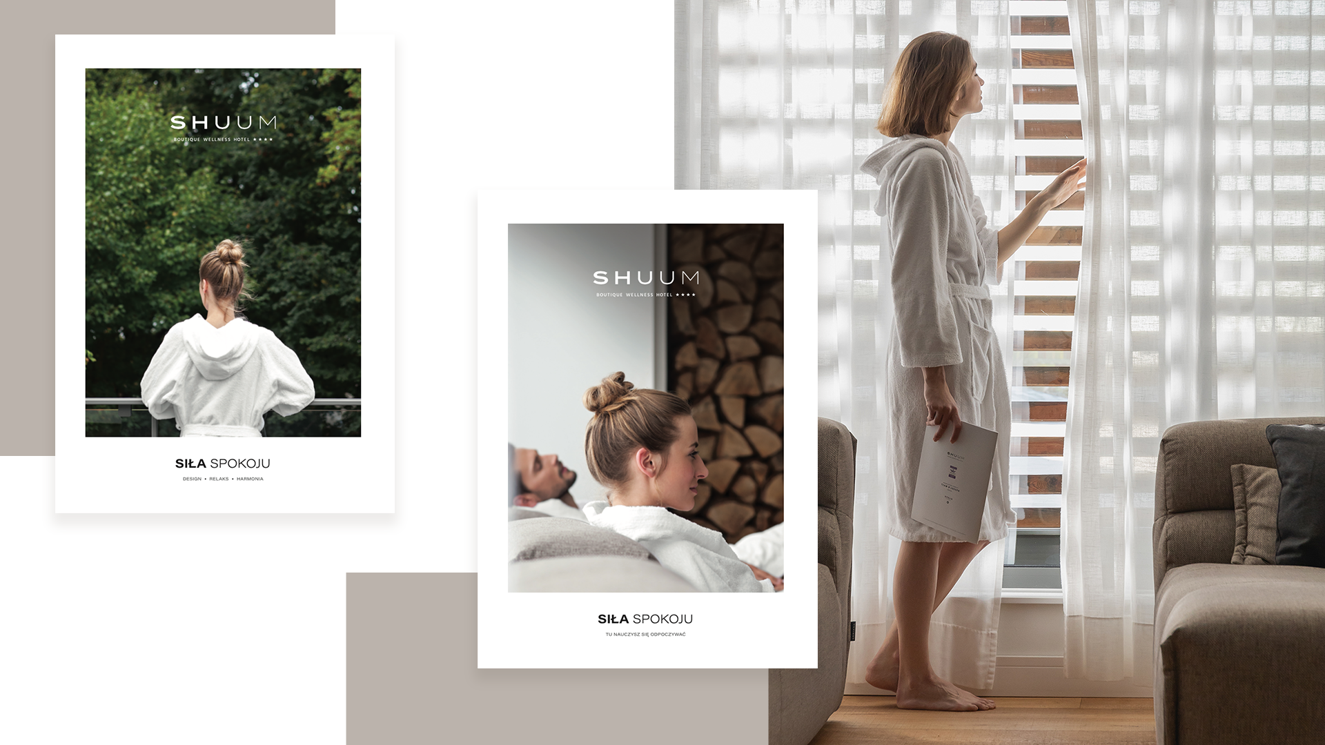
Challenge 2: How to get heard while remaining impassive?
The foundations of hotel’s branding were deep strategy and analysis staying true to our values of workshopping with the client. Together we developed much than just naming, expanding to original brand essence, language, visual communication and content.
Content: based on elements of Stoic philosophy in Scandinavia and referring to the various ways of living in harmony with nature, relaxing and drawing energy from within oneself and the hotel’s offer – translating it through the prism of everyday life, realizing the values of the facility on a daily basis. It’s also a story about “the power of peace” as a state of equilibrium after being in Shuum.
Wording: building on implicit meanings and simple values, simplifying language and using customer references, using instrumentalization and onomatopoeia when talking about the hotel.
Visual language: the use of images based on vital contrast, gradients that create a transition between strength and tranquility, photographs that document phenomena and surprising and harmonious combinations, the use of a natural color scheme that is resolute (strength) but non-irritating (tranquility).
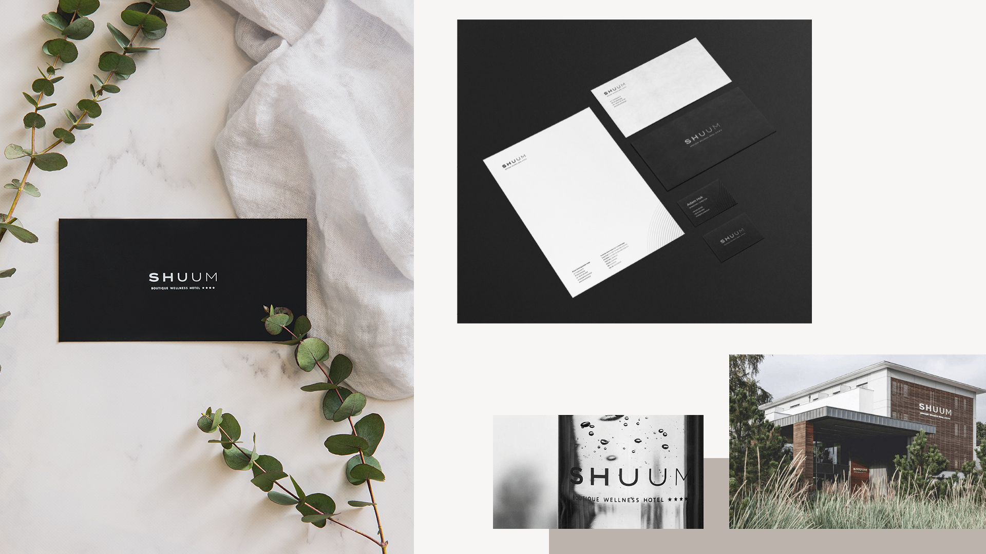
Challenge 3: How to run social media in a nordic fashion?
Re-imagining the hotel identity led to new communication in the form of social media profiles on Instagram and Facebook. A series of creative workshops helped us build a distinctive language and trend observations helped us discover, what the hotel guest expect and how can we attract their social attention.
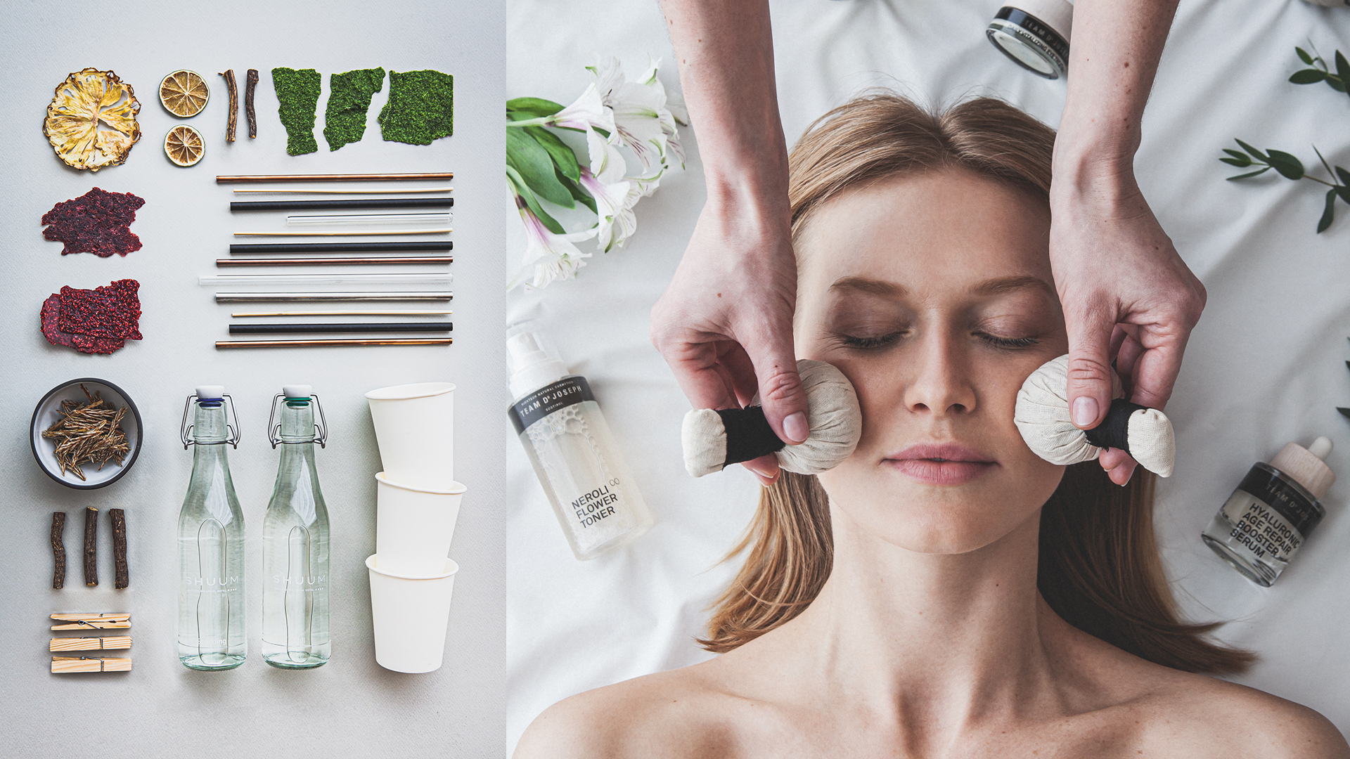
We decided to build our own content, running regular photo and video shoots, cooperating with ambassadors and external partners. Current hotel communication stands for coherence, engaging visuals, storytelling and close relations with recipients.
We decided to build our own content, running regular photo and video shoots, cooperating with ambassadors and external partners. Current hotel communication stands for coherence, engaging visuals, storytelling and close relations with recipients.
Challenge 4: How to achieve digital coziness?
A well balanced hotel website is much more than just an address. Guests expect unique experiences already at the very beginning of their journey, no matter the device, time and knowledge about the brand they already have. The first contact with the hotel itself may as well be digital.
Shuum’s website runs a dedicated custom booking system, launched in order to make the booking experience as complete and engaging as possible. Extensive research using neuromarketing tools at AF.lab facility allowed us to discover true emotions and behavioural patterns of user, what resulted in a well developed UX/UI of the booking engine.
Shuum’s website runs a dedicated custom booking system, launched in order to make the booking experience as complete and engaging as possible. Extensive research using neuromarketing tools at AF.lab facility allowed us to discover true emotions and behavioural patterns of user, what resulted in a well developed UX/UI of the booking engine.
Challenge 5: How to use content to adapt to consumer needs?
Shuum Boutique Wellness Hotel is an unquestionable leader in the spa and wellness HoReCa market in Poland and as a consequence quickly achieved a status of a pioneer, closely analysing trends and individual needs of its guests.
We run communication of key dates and attractions: Shuum&Friends culinary sessions and Evenings with wine. Shuum Deli subbrand was created to promote local, fresh and organic products of the hotel’s restaurant and spa.
Shuum today is a strong, modern brand, close to conscious consumers, who seek highly comforting experiences of relaxation and rejuvenation. Close contact with nature restores vital forces, refreshes your mind and calms thoughts. It is no ordinary hotel facility. Here you will find everything that your mind, body and soul might need – deep relaxation and full rejuvenation.
Zobacz również
Check out our Linkedin
© 2023 | Privacy Policy