How to build an effective product card?
An effectively designed product card increases conversions by up to 30%, as confirmed by AF.lab’s neuromarketing research. Buying a product is a fundamental moment, where every image, every icon, every description or promotional video can have a breakthrough impact on the final purchase decision. Find out how to build a card that sells.
The process of creating a product card
A product card is a solution that requires an optimal implementation path. Therefore, we have distinguished 4 stages of its implementation: analysis, production, implementation and monitoring. Each of these paths is characterized by a specific action, creating an effective end result.

1. analysis
The first step is to study consumer needs and motivations, juxtaposing them with brand realities and product categories. In this way, it is possible to learn insights precisely and, consequently, find answers to customers’ problems.
This is the time to meticulously plan the cards so that they get the highest possible conversion. Based on the research of the target group, one gets to the hidden motivations of consumers and finds a way to meet them. At this stage, it’s also a good idea to turn to proven nerumarketing research, such as:
- eyetracking,
- GSR – skin-galvanic reactions,
- EEG – an innovative method of analyzing brain wave signals,
- in-depth interviews.
The simultaneous use of the aforementioned techniques makes it possible to obtain precise opinions from narrowed and well-targeted groups.
2. production
The design of the card’s appearance must be consistent with brand identity and modern UX/UI practices. Graphics and texts should be developed that highlight the unique features of the product to help make a specific purchase decision.
It is therefore necessary to create a template that is optimized, taking into account the individual characteristics of the brand and the guidelines of e-retailers, in order to accurately present products. The designed modules are ready for quick deployment after filling them with images and content, ensuring smooth control and a satisfying layout. Each of the product cards created must be designed in the spirit of RWD – this allows full accessibility from any device.
3. implementation
The unique design guarantees quick and easy implementation of product cards in the brand’s store and e-retailers. However, it is important to keep in mind the technical parameters of the distributors, so that the quality of graphics and text is displayed at the highest level.
The implementation phase also involves providing extensive automation of card management by integrating it with various systems – e.g. PIM, marketplace or CMS
4. monitoring
In order to provide the best user experience and satisfy the brand, one should not forget to check the correct implementation of the cards. Monitoring, therefore, begins with contacting e-retailers, and the next step is to resolve any technical problems and provide support from a professional IT team.
It’s also a great time to re-analyze the cards and examine how they influence consumers’ purchasing decisions for the brand.
Construction of the product card
Neuromarketing studies repeatedly show that products presented on cards with extensive content (rich content) are the highest rated by respondents, using them as an example to discuss good practices for building a product card.
- From the general to the specific – ensure gradual input to avoid the buyer feeling overwhelmed
- Concise but succinct headlines – accurately convey the key and desired feature of the product and are aesthetically designed, and can be enhanced by using bold or larger font. Such treatments will make headlines more readable and encourage further exploration of the contents of the product sheet.
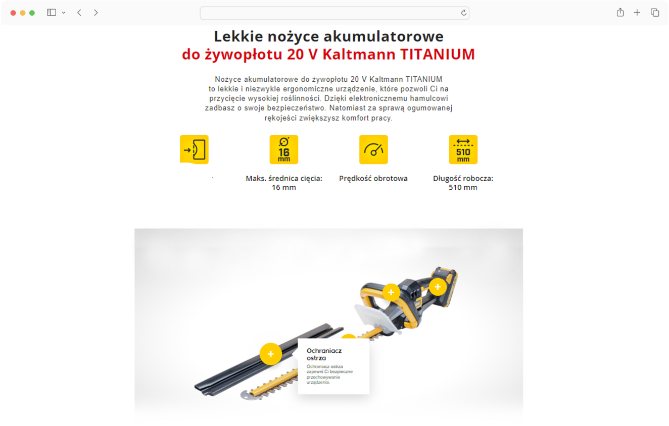
- Interactive modules (e.g. hotspots) – allow active participation in learning about the product without overwhelming the user or creating a feeling of information overload.
- Longer content – go for it, but make sure it is balanced and focuses only on specific benefits for the potential buyer.
- Icons – such a graphic treatment stimulates curiosity, makes content more attractive and better influences consumer perception.
- Guide videos – instead of commercials, choose instructional videos that advise your customers in an accessible way. Don’t forget to tag the content video with a catchy call to action.
- Recommend other product categories – the last module of the card, which will direct the consumer to possible further exploration of your assortment.
- Other variants of the viewed product – show more products including the same category to avoid the frustration of displaying an unwanted product.
- Brand information – consumers choose brands they know or recognize. So it’s worth putting a brief mention of the brand on product cards to appear in the minds of consumers and provide them with basic knowledge about the company.
Summary – benefits of an effective card
Functional design of the card gives the opportunity to easily manage content on the brand’s website and e-retailers. This makes them unique and, above all, consistent, and thus the whole process is automated and more efficient. Proper optimization of descriptions is also a guarantee of better visibility in search engines, and this, as we know, positively affects the increase in conversions.
The attractive form of product presentation attracts the attention of customers, they can learn more about the functions and features of the equipment and look at the product range placed in context. The synergy of image and text in an interesting template retains the user for a longer period of time and allows to increase their purchasing decision.
Read also
- Product card, Rich content
- Maciej Nowacki
- Product card, Rich content
- Maciej Nowacki
- Product card, Rich content
- Maciej Nowacki
Check out our Linkedin
© 2023 | Privacy Policy